Follow Us
The Visual Identity Crisis
Client
Creospark
Year
2021
Overview
Cloudspark EXP is an applications Ecosystem that is built around the modern workplace life cycle. A holistic approach to enhancing employee engagement + experience centered around productivity tools.
I was contracted to design the visual identity of the digital ecosystem.
My role
Visual Design in collaboration with founders, project manager, developers, marketing manager, and UX architect.
Responsibilities
- Branding
- Visual identity
- Ui design
A blank page is intimidating. How about a new design of productivity apps to embrace a new world of work?
In the height of the global pandemic, workers world-wide were forced to adapt to a new way of working…from home. In your basement. Living room. Kitchen. Bedroom. Whatever your accommodation was, it had to be blended with your office space. Physically and psychologically.
Clearly, a lot needed to change – including how people work. But for how long? An extended March break lead to a month. A month lead to several months. Fast forward to now, working from home is a normality.
Millions of people from different industries, locations, and demographics use office productivity apps to help them complete their jobs efficiently. They use different platforms, devices, apps, and are connected wherever they go.
To help make the employee experience more desirable, Cloudspark is developing an office productivity suite that will seamlessly connect Office 365 and third-party apps in one platform. From writing quick notes to booking hotel rooms during a work trip, this suite will help you stay organized, be more productive, and help employers retain talent by providing great employee experiences. Great design will make these experiences fluid and seamless.
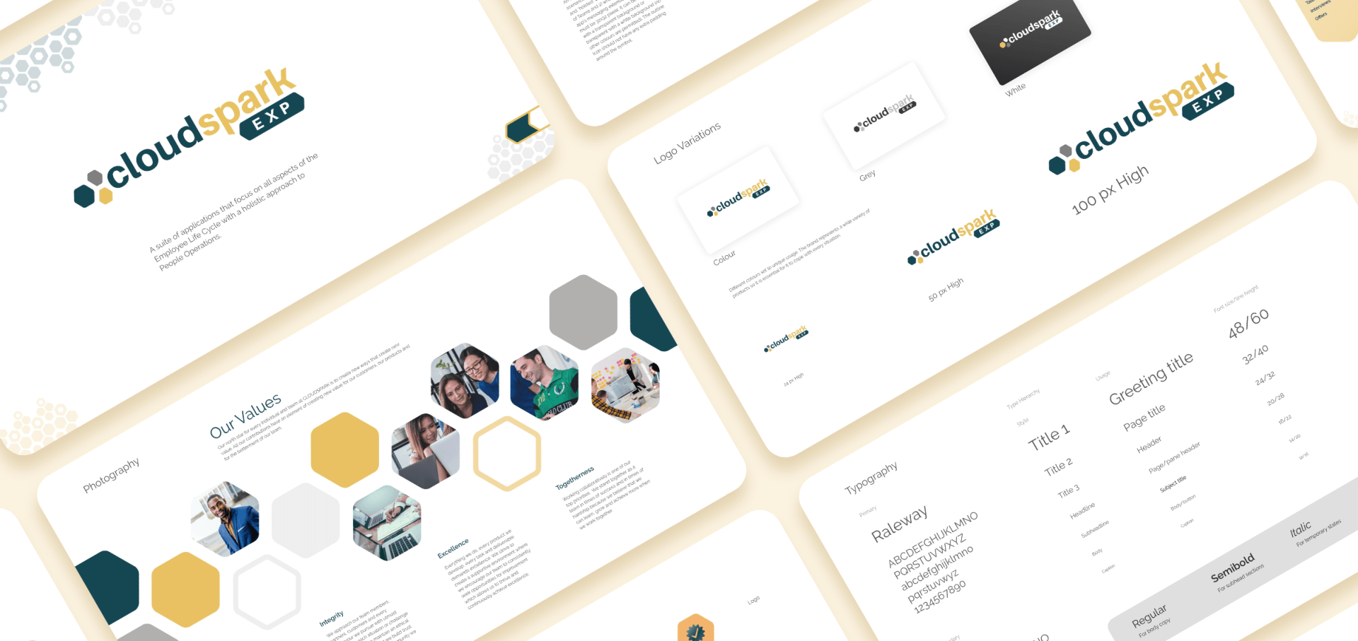
Parent Logo Refresh
The founders had already developed a parent logo. It simply needed a few tweaks in order for the entire suite to have a unified look; Exploration of colour, negative space and boldness.
Suite Logo Design
With the founders vision of the suite in mind. The portfolio brand logo was designed to embrace that essence.
App Icon Design
The app icon followed suit. Using strong colours and bold shapes.
Child App Icon Design
The new child app icons used colour differentiation to create personality. Hues are light and friendly. Simplicity was key. Each icon has an identifiable symbol that connects it with the collective suite.
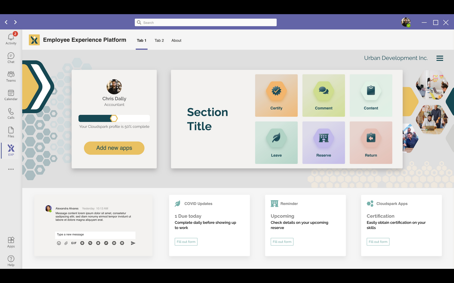
Dashboard Design
The modern workforce utilizes multiple platforms and devices within offices at work, at home, and on the go. The apps desktop interface allows for a customizable dashboard. The ability to place the most important content on the users’ home screen keeps them organized and productive throughout their work day.
Interface Design
The interface for the individual apps are flexible to allow the integration of table data and the inclusion of modals and cards.
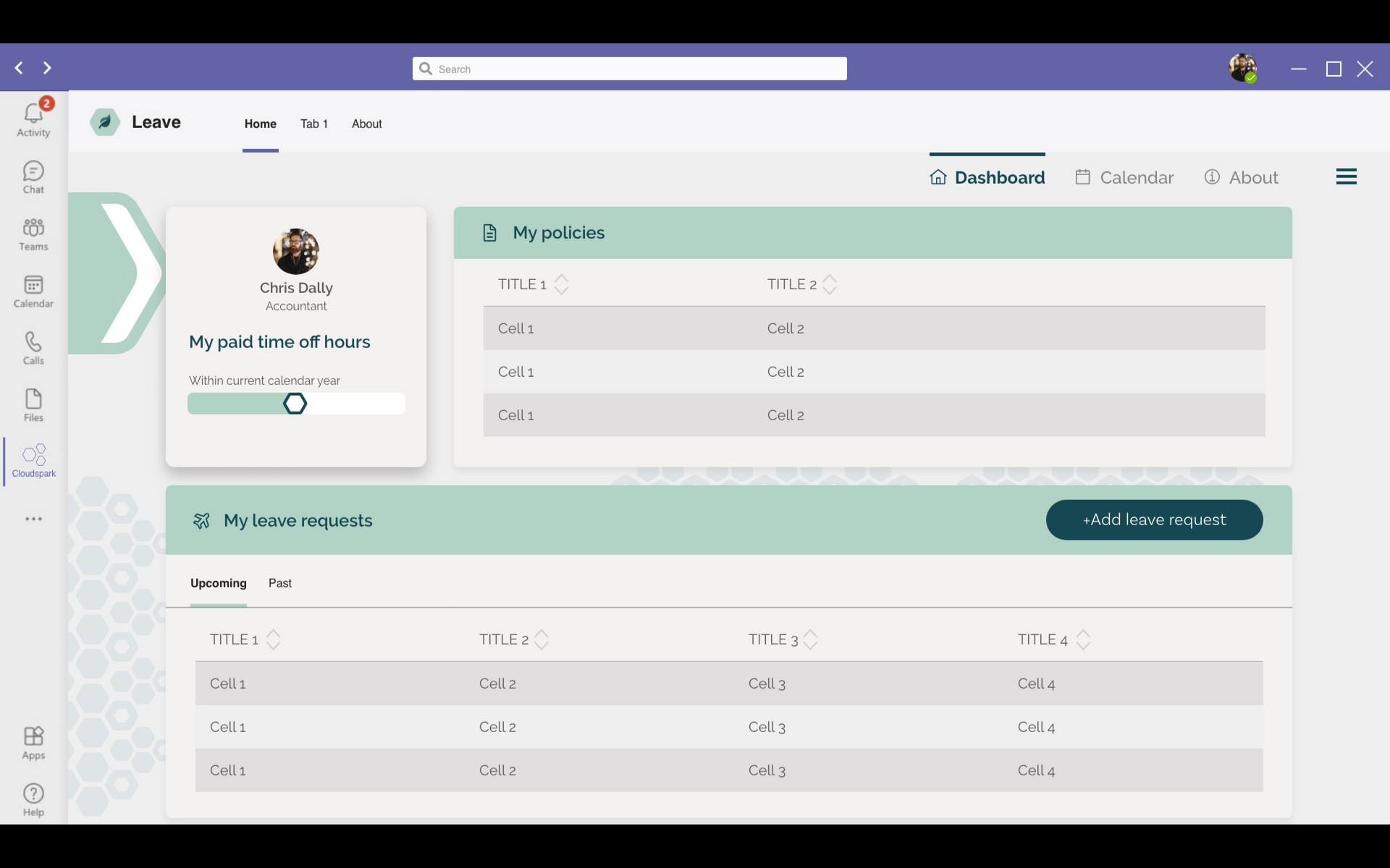
The design solution was to integrate the honey comb shapes from the original parent logo to maintain familiarity, unity, and emphasis on simplicity. Branding, icons, and interfaces were all a result of many iterations, a lot of research and testing, loads of coffee, late nights and weekends. The first journey is in the books. Next steps will be ongoing as the suite grows.
My Take-away
- Design is essential. The designer is responsible for informing everyone on the team the importance of the visual solutions.
Design Process
Many many many iterations
Deliverables
Brand guide, Logos, Dashboard components
4 months
Visual Design
